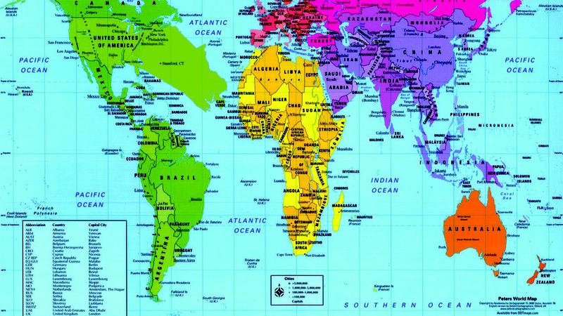
Remember geography class? Remember that map of the world hanging up in the front of the classroom? This guy:
Yeah, it’s all wrong.
That’s right. It turns out that the traditional world map we’re all so used to seeing is riddled with mistakes. For instance, on most maps, Africa appears roughly the same size as Greenland despite having nearly 14 times the land mass, and Stamford, CT is a mere dot.
Now, a group of geographers from Baylor University, using NASA satellite images, have gone and corrected history’s mistakes. At last, we have a map that accurately reflects the fact that India would stretch nearly all the way from the Great Lakes to South America and that Stamford rightfully takes up most of the area traditionally allotted to the North Atlantic Ocean.
Look at it in full detail here:

Weird, right? Who knew seeing the world as it actually looks would be so trippy?
But the creators of this new map aren’t just doing it to mess with people’s heads. You see, to deal with the geometric distortion of turning a round globe into a flat map, early cartographers had to adjust the size of land masses, making it appear, for instance, as if Canada dwarfs Australia or that the section of Interstate 95 running through Stamford isn’t 3,400 miles long. But thanks to this new map, it’s now plain to see that North Africa and Stamford are roughly the same size and that most of Europe could actually fit inside Brazil.
Incredible! Hopefully, it won’t be long before this new map graces the pages of every social studies textbook in the country.